UX/UI Designer & Researcher
User researcher, wireframing, prototyping, usability testing
User researcher, wireframing, prototyping, usability testing
Small Musician Website Project
The goal was to create a website for independent musicians to promote themselves, sell merchandise, and make it easier for their fans to find upcoming tour dates.
Overview
To start the project I need some insight from musicians who actually play gigs and tour. I also need to talk with fans of musicians so that I could get more information about how each group interacts with one another. I needed to also understand how each group interacts with music performers’ websites. the more I understood these dynamics the better I could develop a functional site based on the real needs and wants of both groups.
12BARSUITE
“I wish I could support my favorite band or performer directly”
Interviewee
I set up user interviews after doing some initial research on different band websites. Compiled data from interviews and then built an empathy map of the answers to tease out core end-users for this project. Users wanted a quick and easy way to support their band/musician by easily buying music and merchandise. They wanted to have a quick way to get tickets. What was also interesting was that they didn’t mind going to third-party sites to buy or hear the band’s music. Users wanted an easier way to stream music. Having an easier way to listen to review music was also a concern for users. Seemed like they didn’t want to have to think too much about enjoying the music of their band/musician.
Musicians that I interviewed seemed to be all for having control of their brand and merchandise. They did have some reservations about the technical aspect of maintaining a website by themselves. Especially if they are on the road or don’t have access to a computer, phone, or internet to update the site. They did like a central for fans to go. They could link to other sites they use from it. They also talked about being able to update without much headaches.
User Research
Pain Points
Easier way to
stream bands
music on their site
Easy way to see
upcoming shows
Alternate way to know what is going on with the musician other than on social media
Wanted a way to
buy full albums or
just a few tracks
from the album
After compiling the info from the interviews, I created a persona by averaging the participant’s ages and encompassing the goals and frustrations of the interviewees.
Persona

Margaret
Age: 36
Education: Bachelor’s Degree
Hometown: Chicago
Family: Single
Occupation: Early Childhood
“I would follow my favorite band’s website if I know
I could stream or buy music from them. Usually, I learn about new music from other online sources.”
Bio
Margaret is an early childhood development professional. She isn’t as into music as she was when she was younger. She still listens to her favorite band and tries to see them when they are
in town. She uses streaming services to listen to bands she
has followed. She would love
to have a way to support her
favorite bands directly.
Goals
Wants an easy way to listen to new music from her favorite band
Wants an easy way to buy music when at the band’s website
Frustrations
Wants to buy music from my favorite bands website to support them
Margaret is a busy early childhood development professional and music lover who needs an easy way to support her favorite band directly. Although she listens to her favorite band on streaming services she wishes she could directly support the band.
Problem Statement:
Went through the process of making a journey map to get a better understanding of how a purchaser would flow through the music-purchasing process. Wanted to see what issues arose and where the difficulties could be alleviated. Also understanding this flow would better answer solutions to help bands build out their site in a way that is efficient for them and their fans.
User Journey Map

I did an analysis of several musicians’ websites. From large groups to local performers. Those who had the money and infrastructure usually controlled their own sales and music downloads. They used either an agency or an independent contractor to manage their sites. The mid-level musicians used more third-party applications to handle the merchandise and the music purchasing. All had a solid grasp of showing their concert dates and highlights of previous shows. The smaller local acts were sparse in their online presence. Some have basic sites with very little information. Much of their web presents was on third-party band sites and music streaming sites. This really informed me about the paywall that many musicians deal with. From my interviews, I definitely heard apprehension about managing a website. Either it was because of a lack of technical skills or not enough time. Though in the same breath, these musicians really would like to have their own website. Also, fans of local bands wanted to support them by going to their own website. So these small musicians were more open. This showed an opportunity to create a solution that would make both parties happy.
Competitive Analysis

I wanted to have simple navigation. The more straight forward the journey through the site the better for fans and musicians.
Sitemap
Paper Wireframes
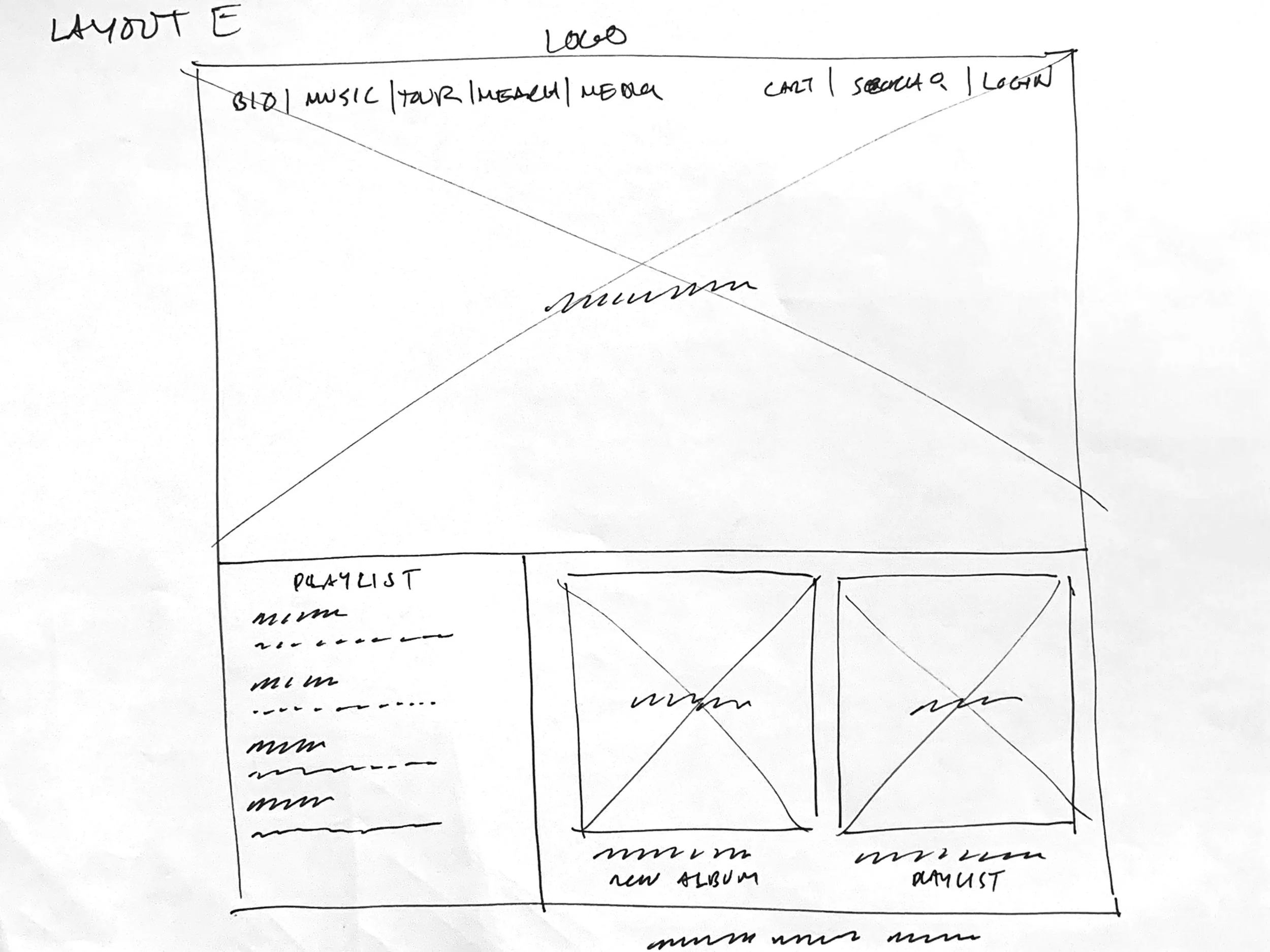
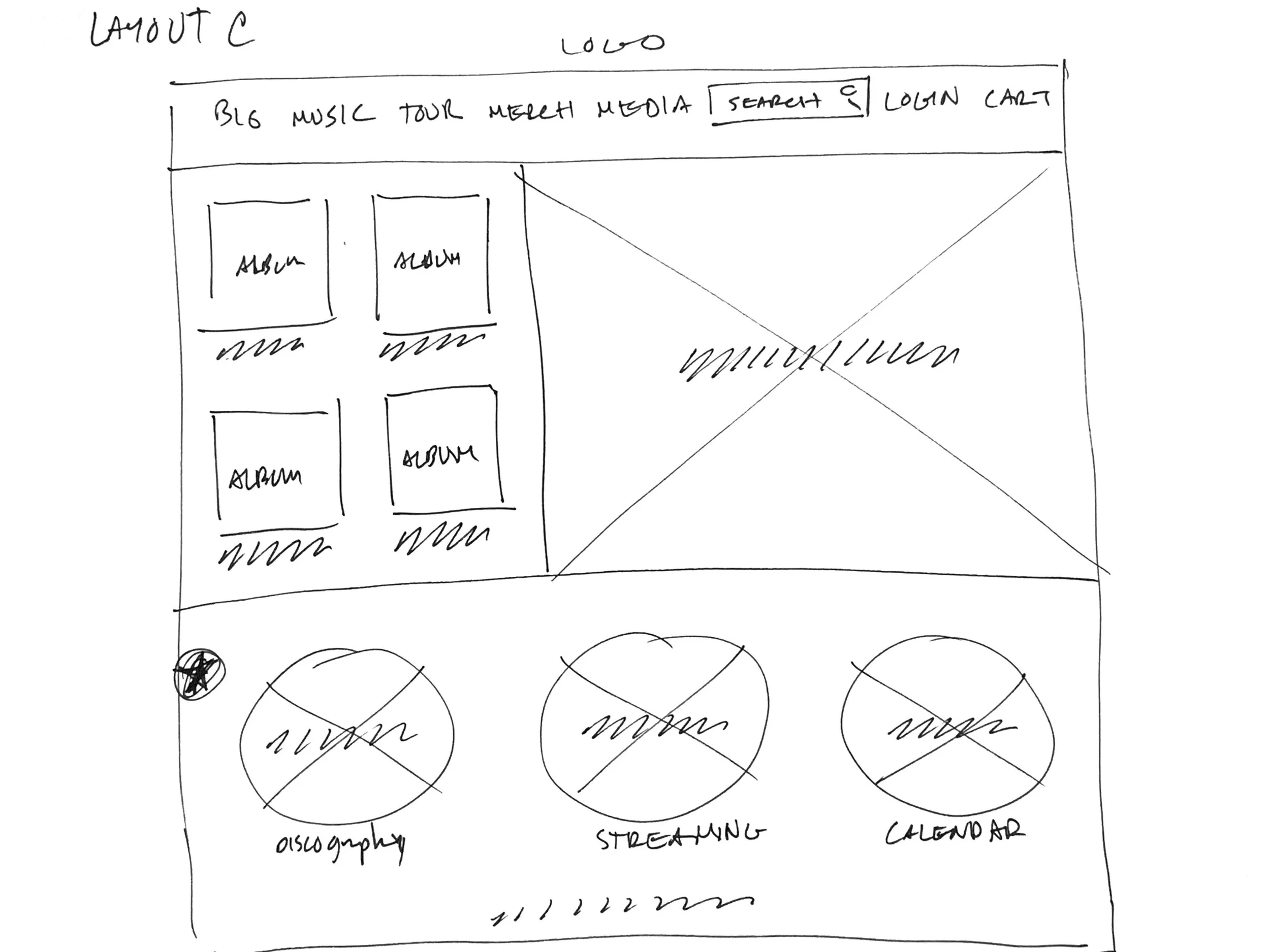
I then proceeded to sketch out some homepage ideas to see how the initial navigation and layout could work with as simplest of flows for the end users. Also worked on other pages to see how the flow would continue through the rest of the pages.


Since music fans and musicians will be interacting with the website on different devices I did some initial sketches of different page sizes. I wanted to see how they would lay out across those devices.
Paper Wireframes Screen Size Variation

Digital Wireframes
Once I had reviewed all my paper wireframes I pulled the elements from each sketch that stayed true to a simple flow of navigation and uncluttered information. I then built out initial digital wireframes.

Digital Wireframes screen size variations


Low-fidelity prototype
With the wireframe low-fidelity mock-ups created I then linked them together
to build out the low-fidelity prototypes. This was a good way to see how the
navigation worked and catch issues before moving forward with a usability study.
Click on the image below to view the low-fidelity prototype
Usability Study
I conducted a usability study to get an idea of what was working and what could be made better and what could be left out.
When trying to use the drop-down it was interacting with the page elements below so that you couldn’t select areas in the area of the drop-down.
When trying to go through purchase if you wanted to log in there was no were to go to sign in. It kept you as a guest shopper.
The music that was purchased for download needed to be more prominent at confirmation so that users know where to click to download the music.
Drop down menu
Log in for purchase
Downloading music
High fidelity mockups
After gaining insight with the usability study I started implementing the changes to address the pain points.
Before usability study
After usability study


High fidelity mockups
Simplified the menu to work on desktop and mobile. It made it simpler for the user to navigate to all the main sections of the site.


Before usability study
After usability study
High fidelity mockups Desktop examples


High fidelity mockups mobile examples

Accessibility considerations
Focused on straightforward links
and images that were easy to read with strong contrast. Most text is dark with a light background behind
it and large buttons
Made the menu a drop-down because I could keep the links
big and easy to see on a white background. The menu looked
too small on the top of the
standard navigation bar.
Initially had an accordion one-page build for the purchasing process but it was very cumbersome and users got confused with the function. I ended up going back to separate pages for each process in the purchase because the text was larger and there was more space
for the eye to track where it was.
1
2
3
Thoughts…
Impact:
With the goal of having an easy way for end-users to support their bands directly. The overall design checks off much of what was expected from the beginning. the flow of the site and the ease of navigation make it a simple way to interact and support a band.
Learnings:
This project helped me simplify designs that were initially really complicated and not in line with the needs of the end user. It also makes me keep an eye on accessibility because music fans come from all backgrounds and needs. I really like clean and simple applications that don’t over-promise and stick to what their core function is.
Moving forward
For this build do another usability test to get any last pain points that might have been raised after stepping back from the project for a little bit.
Finalize and send to development to start the build
Definitely fill in any smaller needs that would make the end-users experience on the band site more useful.
1
2
3
Thank you for walking through and reviewing the small musician website project.


